 Please see the earlier section on Responsive Layout and Control Properties within the Getting Started section for details on how to change labels, control names and control types, as well as introductory information on the approach for layout and styling of controls. Please also see the later, dedicated, sections on Labels and SASS/CSS styling for more information.
Control Values
Most controls that can display or capture information will have a set of values. These values can range from a simple piece of text, a number or a complete list of options that can be used to select single or multiple items. Some complex controls can also capture complete, structured data sets for storage and retrieval.
WebMaker controls are data bound by default and you have the option to enter a static value or dynamically bind to server data (Server Controllers are required for data submission). If the dynamic option is selected, you will have to review or enter binding XPaths on the Bindings tab. This same approach is used to control many dynamic aspects for controls, including conditional visibility, event handling, etc.
Text Boxes
The Value is entry for single text value type fields (Text Box,
Text Area,
Hidden,
Passwordand
Output) specifies whether the initial value should be
staticor
dynamic. If static is selected, the required value should be entered into the Value text box. If dynamic is selected, the binding information will be required for this field, indicating the location of the data (see Bindings for more information). If dynamic is selected, you can use the optional Default Value text box to specify a value that should be used if none is present in the source data matched by the data binding.
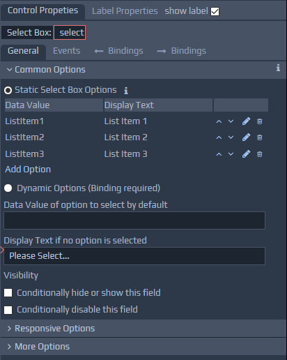
Select List Controls
For list type controls (Select Box,
Radio Buttons,
Multiple Checkboxes,
Tabs), etc., you will see a table of enumerated options. These are the static options, which you can amend by adding or removing items. If you tick the dynamic option, you can specify a location for your dynamic data on the Bindings tab). With this category of controls, you have two optional items. The Data Value of option to select by default indicates which value to select from the list by default. The Display Text if no option is selected enables you to specify some text if none of the options are matched, e.g. Please Select... You may also see the No. of Entries option that restricts the height of the box containing the options list, by only showing the stated number of options. The two list boxes are related and show the Data Value and Display Text for each enumeration. The data value represents the value used 'behind-the-scenes' for the enumeration in the data sent to the server (Requires Server Controllers), whereas the display text shows the text that will be visible to the user of the page. The Use these enumeration values for output display checkbox indicates whether these values should be used as a mapping between data and display for output information. For example, a page may display the current status of an order, but this status may be represented as a code within the system. Therefore, by setting the data values to the possible codes, and the display texts to the relevant display messages, the system will convert the code number to a helpful message for the user if this checkbox is ticked.
Single Checkbox
You can indicate the ticked and unticked values by using the Ticked Value and Unticked Value fields respectively. This value is submitted from the page and will be compared against the data that is used to create the page to determine whether the checkbox should be selected initially (Requires Server Controllers). You can determine the ticked value dynamically. If you click the dynamic option then use the data binding tab to define your XPath to locate the ticked value. The optional Default Value option can be used to set the default data value to use if there is none in the data used to create the page. Setting this to the checkbox value will cause the checkbox to be selected by default if there is no data going to the page indicating otherwise.
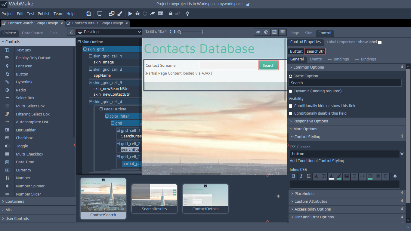
Buttons
For a button type control, the caption shown on the button can be staticor
dynamic. The static caption should be entered in the Caption is text box if required. A dynamic caption requires binding information. Note: Buttons have a caption that is the value displayed on the button. They can also have a separate Label, like most other controls, although this label is switched off by default. Also see later section on Labels.
Images
The Location (URL) is used to point to the actual image file. If the dynamic option is selected, a URL will be obtained by using the binding specified on the Bindings tab. For the dynamic case the Default Location (URL) is used if nothing is matched by the binding XPath. Any valid URL can be specified, including local, relative address references within the Project Repository of existing images. A link is provided for launching the Project Repository, which can be used to upload and select images. The URL can also be a remote location e.g. http://www.hyfinity.com/images/image.png
Control Visibility
The Visibility section under Common Options provides options that can be ticked to indicate whether you want to conditionally hide, show or disable controls. When you use these options you have full access to the Condition Editor, which you can use to construct conditions ranging from simple value checks to sophisticated multi-part data checks that determine the visibility of your controls.
If the Conditionally hide or show this field option is selected you can provide one or more conditions that determine when this field will be visible. You can decide whether you want to use Hide Ifor
Show Iflogic to suit the semantics of your particular condition. As you change the values of the fields, which these conditions depend on, they will be rechecked and the visibility of the control updated accordingly. For each condition, you set the field (or display variable) that you want to check, the type of comparison that you want to perform (equals, less than, etc), and the value to compare against. This can either be a static value you enter at design time, or retrieved form another field, etc. You can then use AND and OR operators to build up complex visibility checks. Initially, the conditions will be displayed in an easy to read, read-only, format. You can simply click on the condition to enter edit mode.
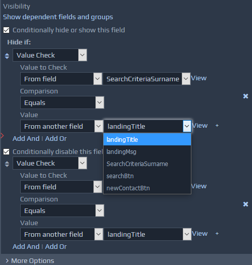
 You can use the drop downs to select the required values. To delete conditions, use the 'X' button on the right hand side. You can drag to reorder the conditions. To build complex checks, you can use the
 Add Andand
Add Orlinks that are shown when you edit a particular condition. Clicking one of these will add a new condition that will be 'and'ed or 'or'ed with the one currently being edited. Beside each selected field (in edit mode) used within these conditions, you will see a
Viewlink. You can use these links to see summary details for the particular field. If the field, for which the visibility condition is being defined, is also controlling the visibility of other fields or groups, you will see an additional link called
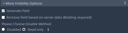
Show dependent fields and groups, which can be used to see the details of these dependent fields. See the Events section for more details about the construction of conditions. The Conditionally disable this field option allows you to disable the field based on runtime data. For example, we may have a button on a page that can only be used by certain types of users based on access permissions. In this scenario, you could set to disable the button if the current user isn't allowed access. See the More Visibility Options section later in this document for additional visibility settings.